Each element of your form has a number of possible settings: features, visibility, advanced options, display options and help. The options that will be detailed in this tutorial are to be set in each element that makes up your form. You can do it by clicking on the pencil icon next to the various elements.
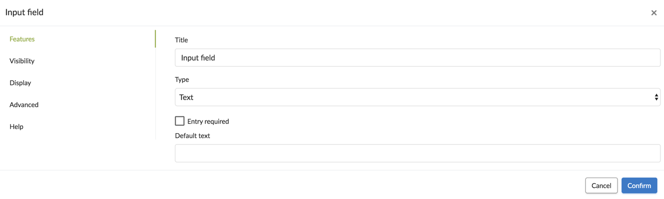
 Element options: General properties

Under the Features tab, you will find various options relating to the specific element:
- Title: Rename the element. In the app, this will be the name that you will give it. For example, an entry field can be renamed "Project name".
- Required entry: By checking this box, during form entry, you make the entry element required. The user must fill in the entry in order to save the form.
- Default value: You can specify a default value if you do not manually fill in this field. You will also find "default text".
- Type with a list of style proposals: "text, digital integer, digital decimal, phone number, email, address web site." Select the response that corresponds to the function of your field.
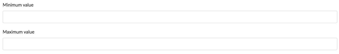
Other properties.
- Minimum value and maximum value: For a graduated scale, as an example, set the maximum and minimum values of this scale.
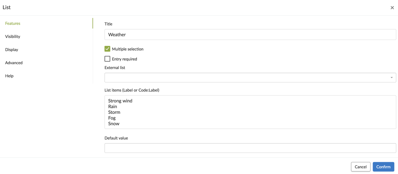
- Multiple selection check box: By checking this box during form entry, you authorise the user to give several responses using a multiple selection list.
- Authorise multiple photos, Authorise multiple drawings: You authorise the user to take several photos or make several drawings.
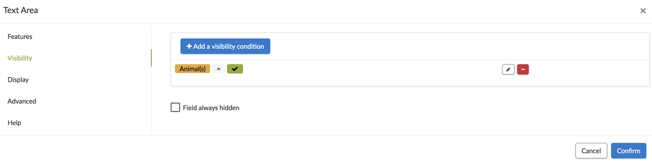
Visibility options.
- Visibility: This tab allows you to make an element visible based on the presence of another. For more information on visibility, you can consult our tutorial.
Display option.
- Remain on the same line when displayed on a mobile device check box: It displays several elements on the same line. Practical when you are on a tablet!
- You can also change the size of elements that are displayed side by side: larger, smaller or normal.
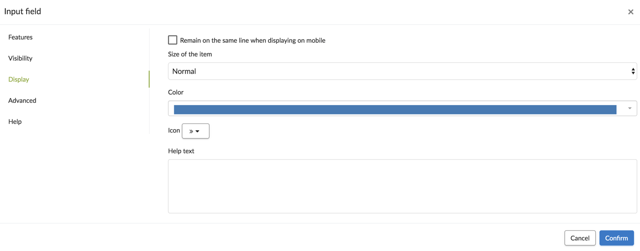
- You can choose the color and the icon of the element.
.jpg?width=637&height=406&name=T1%20(14).jpg)
- You can help your user by adding a Help text.
.jpg?width=637&height=239&name=T3%20(6).jpg)
.jpg?width=549&height=549&name=T2%20(11).jpg)
Important: You must also authorise the display of several elements on the same line for mobile devices. Go to the options of the Kizeo Forms app.
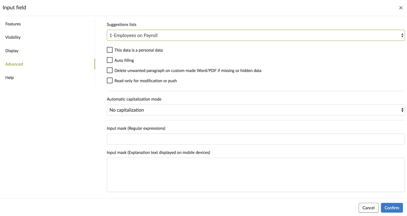
Advanced options.
- It is possible to set Automatic capitalization mode and add a suggestions lists for the Entry field and Text area
- Delete unwanted paragraph on custom-made Word/PDF if missing or hidden data.
- Read-only for modification or Push check box: For Push, transfer or modification of data already saved on the server; this option makes the field uneditable. In the case of Push, this option is very interesting since you know the data that must not be modified by field users, so check this box!
- Add an input mask: it refers to a string expression and prevents transcription errors.
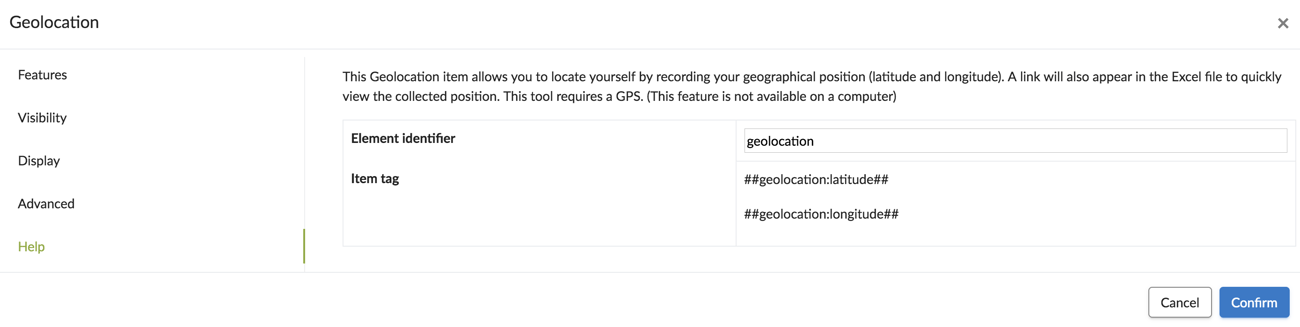
Help.
- You will find the element tag, which is its identity. When adding the element to the form, you may change it before saving your form on the server.
- The tags are used when creating custom-made Word, Email or Excel. For more information on tags, you may consult our tutorial.


